Trip Buddies-Travel App Case Study
PROJECT OVERVIEW
01 | Objective
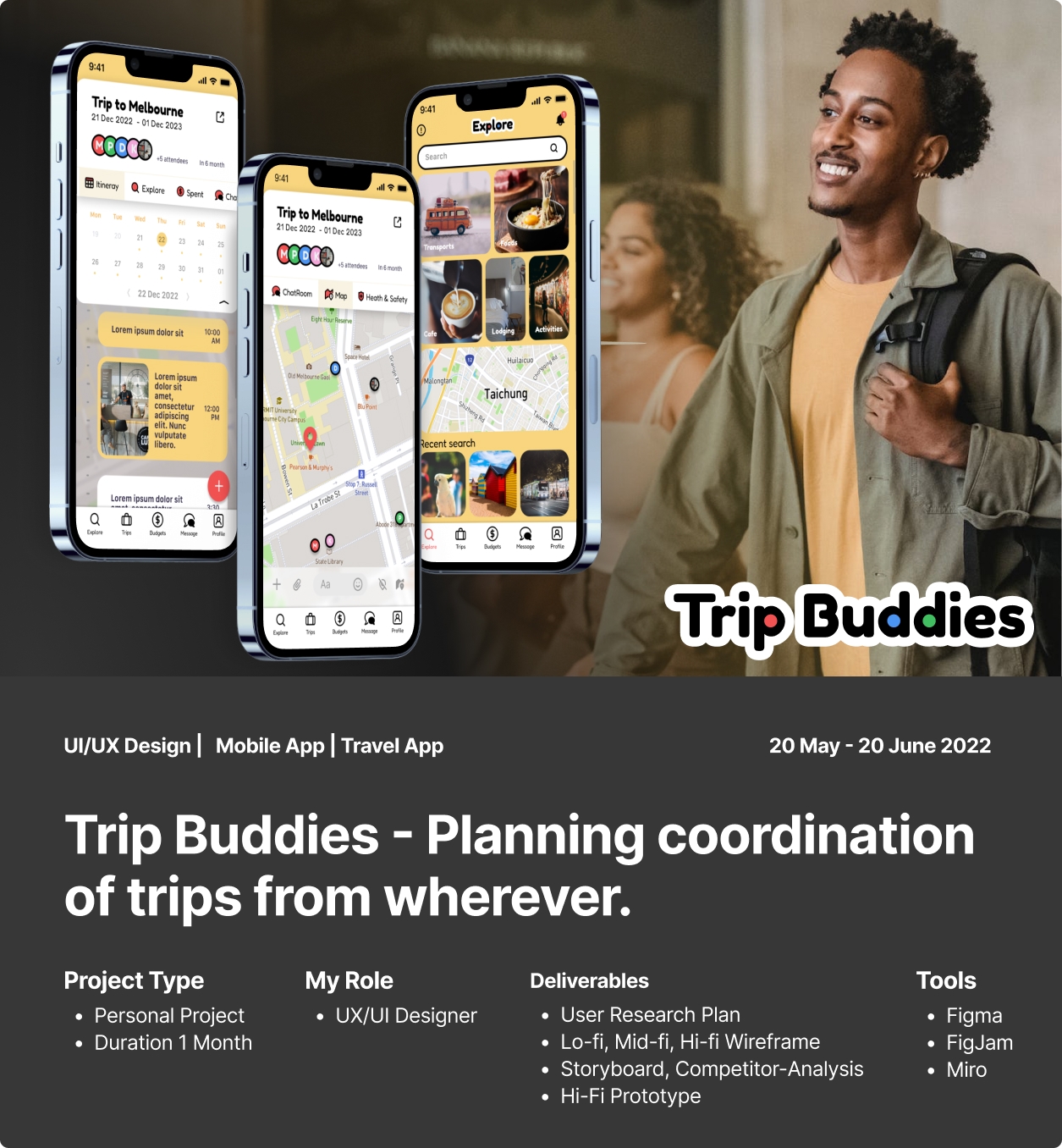
The goal of a new travel startup is to build a modern-day mobile app that helps people plan their next trip post-pandemic.
02 | Deliverables
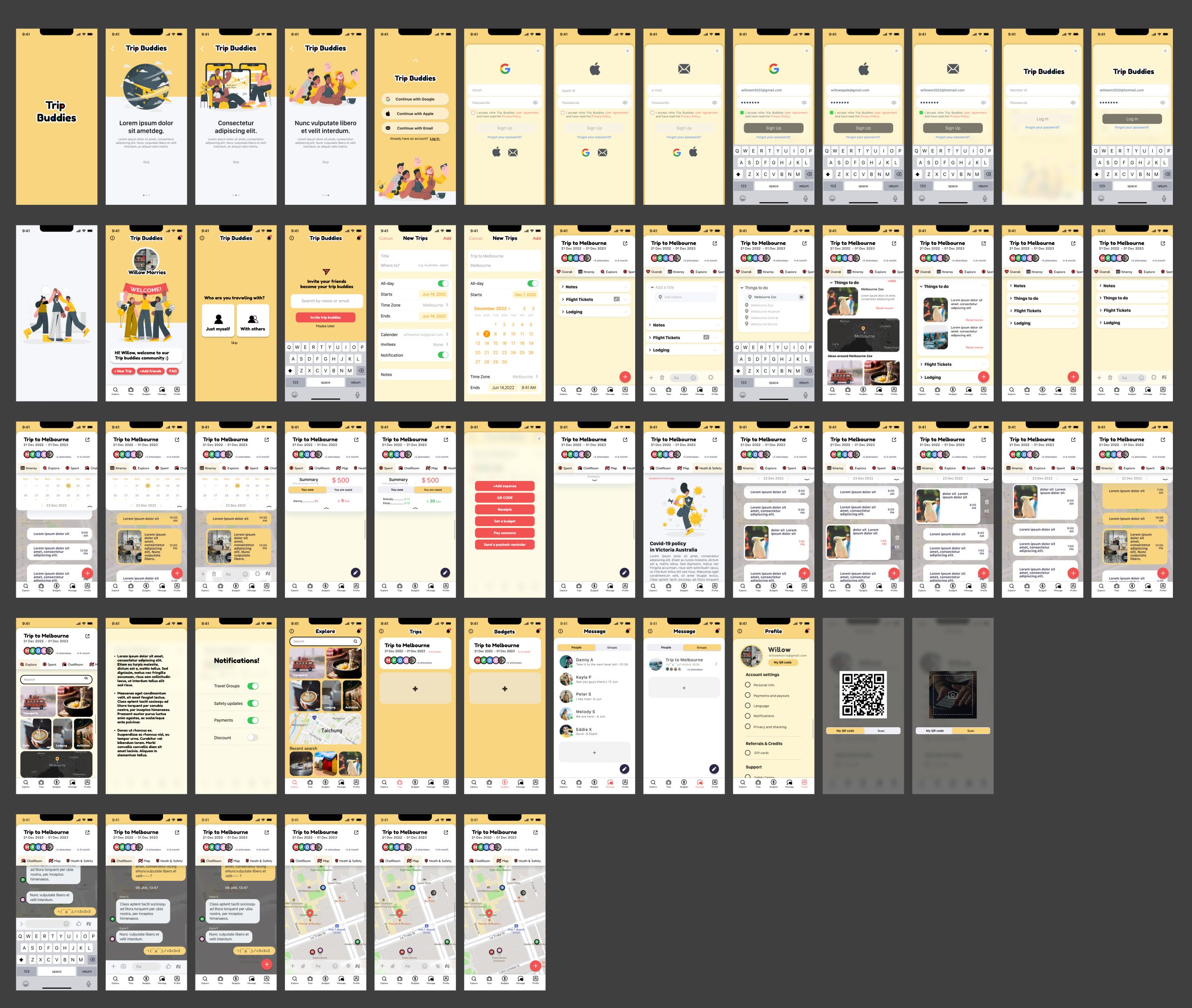
I completed the initial user research, affinity diagram, user flow, competitor analysis, lo-fi, mid-fi, and hi-fi wireframes, user testing, UI design, and hi-fi prototypes.
03 | Challenges
During the early stages of user research, I found that it can be difficult for people to coordinate travel due to busy schedules at work or with family. Additionally, it can be hard for people to manage a budget with others, such as missing invoices or forgetting how they spent money.
Another challenge is that people find it hard to keep up with current travel restrictions after the pandemic because policies vary from country to country and are constantly changing. A lot of information online has not been updated.
04 | Outcome & Impact
The app idea is intended to help people coordinate trips so that more dream trips can become a reality after the pandemic.
BACKGROUND
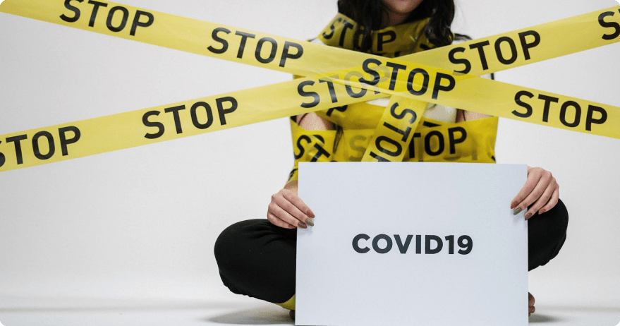
The modern-day travel industry has been heavily impacted by the ongoing pandemic, with many people hesitant to embark on trips due to health and safety concerns. As a result, a new travel startup has recognized the need for a convenient and reliable way for people to plan and book their post-pandemic trips. To address this need, the startup has decided to build a mobile app that helps users easily and confidently plan and book their travel arrangements.
The app will feature a range of helpful tools and resources, including destination recommendations, flight and accommodation booking, and itinerary planning. With its user-friendly interface and comprehensive features, the app aims to make the process of planning and booking a trip as smooth and stress-free as possible. By offering a modern and convenient solution for post-pandemic travel, the startup hopes to help people safely and easily explore new places and create unforgettable experiences.
PROCESS
WEEKLY TASKS
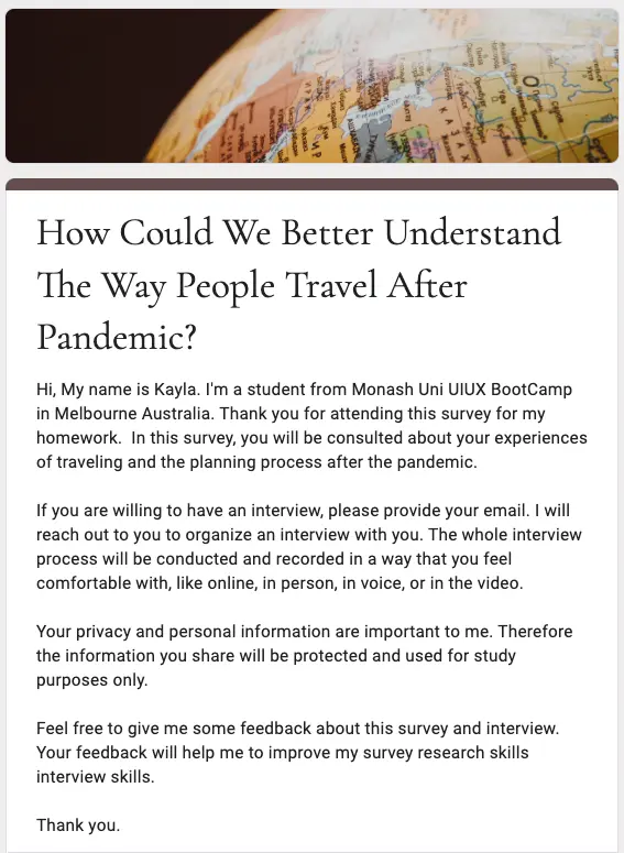
- Crafting a user research plan, writing an interview script, and conducting user interviews
- Synthesizing research into an affinity diagram
- Creating an empathy map for a potential app user
- Developing a user persona from an affinity diagram and empathy map data
- Defining a user insight and constructing a problem statement that you use as the basis for an ideation session.
- Executing an ideation session based on the I Like/I Wish/What If method, and creating a feature prioritization matrix based on your ideation results.
- Crafting a value proposition statement that serves as the basis for the user scenario, storyboard, and user journey map you create.
- Creating, conducting, and analyzing the results of a guerrilla user testing plan
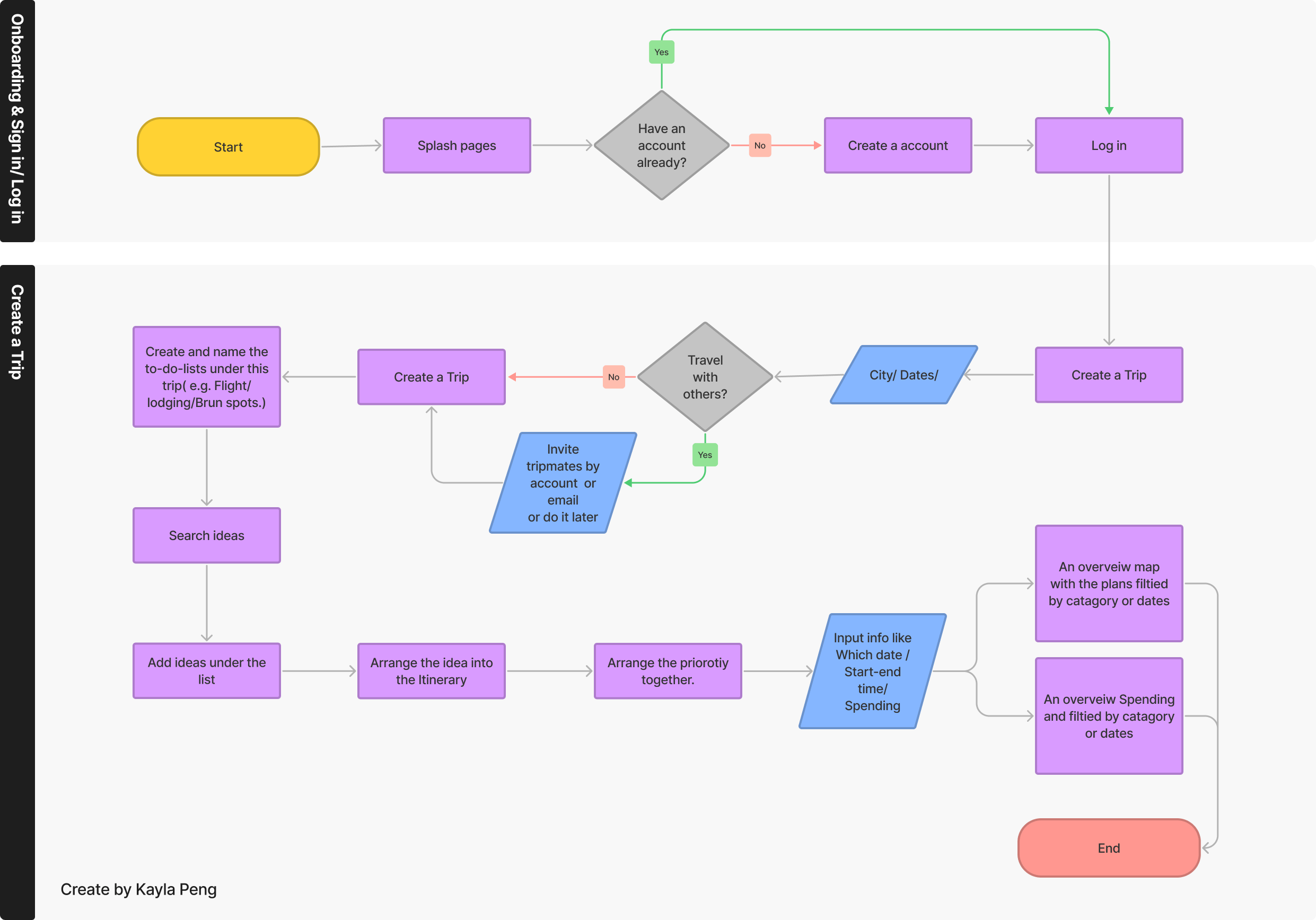
- Using testing results to iterate user flows and digital prototypes in Figma
- Iterating digital wireframes for iOS or Android operating systems
- Iterating a clickable prototype using Figma
- Completing a mobile app UX case study
EXPLORE CHALLENGES
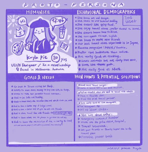
To help me design for our users, I developed a user persona called ‘Kayla‘ and she has been thinking about going back to Taiwan and visiting her family after the pandemic. She needs to be able to find the right information to help her travel back to Taiwan.
Proto Persona
I initially interviewed 11 users, Around the world and mostly young working male and female who lives in Australia demographics. I asked questions mostly about their overall experience of their latest travel experience.
COMPETITOR-ANALYSIS
Competitor analysis is a valuable tool for businesses because it allows me to identify and learn from the successes and mistakes of their competitors. By studying the competition, I can avoid duplicating features that are already oversaturated in the market and instead focus on developing unique or improved offerings.
Conducting a competitor analysis can also help me identify opportunities to differentiate myself from the competitors and potentially gain a competitive edge.
For me, competitor analysis is like standing on the shoulders of giants, as it allows businesses to build upon the knowledge and experiences of others in order to make informed decisions.
DEFINE CHALLENGES
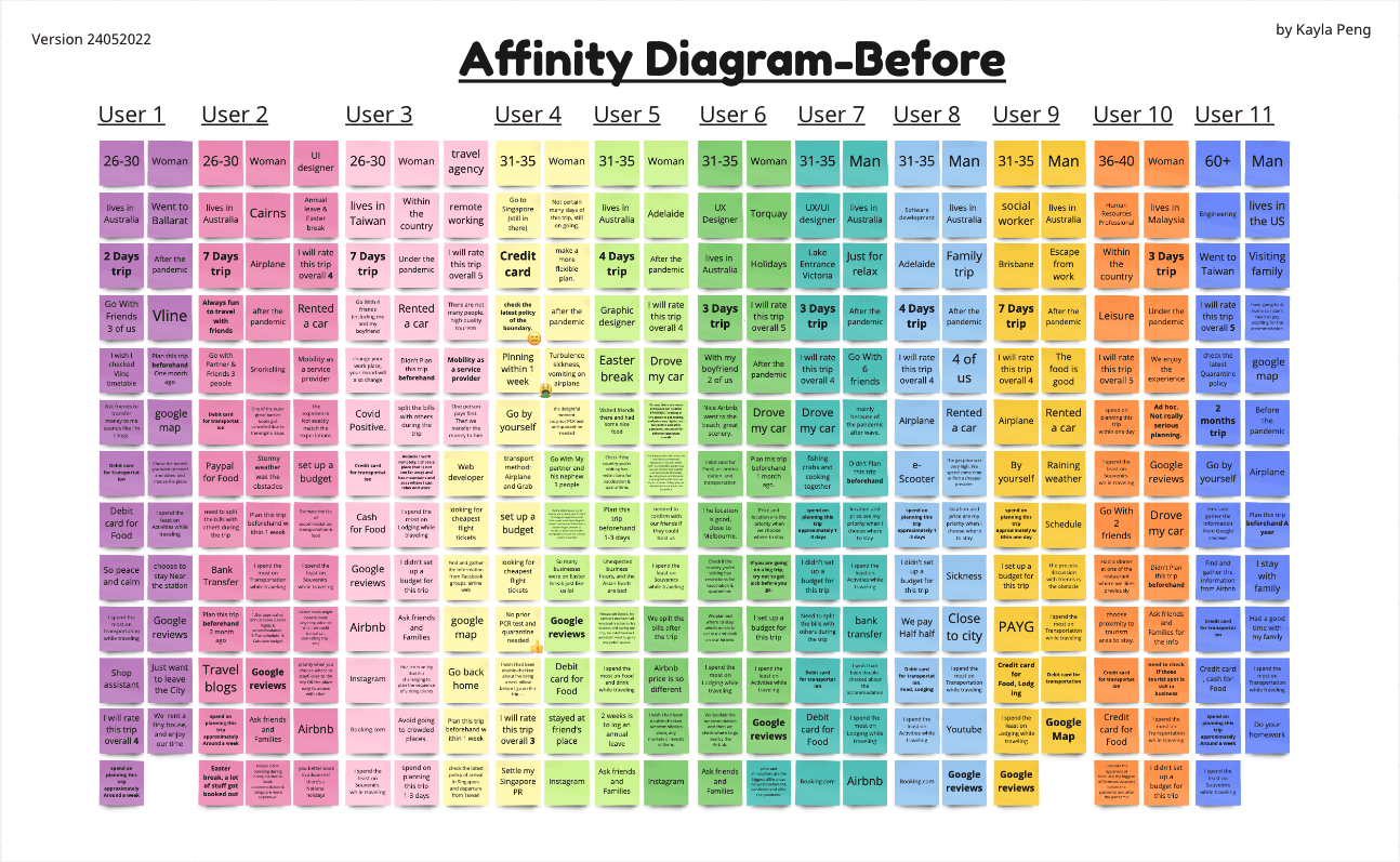
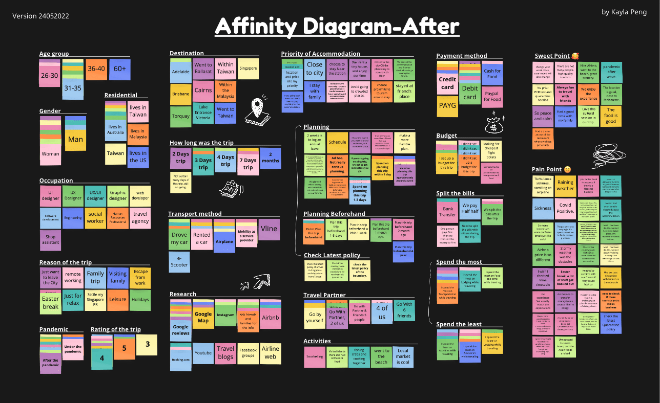
To organize large amounts of data and combine multiple sources of research into natural groupings, I made affinity diagrams to discover relationships, patterns, and similarities among the data.
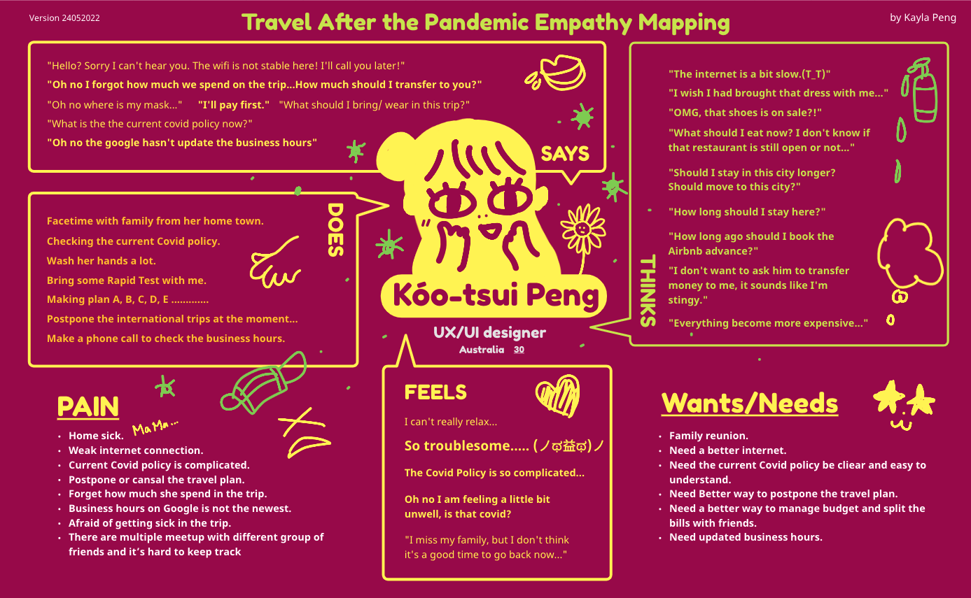
After gathering user data and before product requirements exist, I built an empathy map that refers to data from the user research phase of the design process—such as interview data and affinity diagrams.
User Scenario
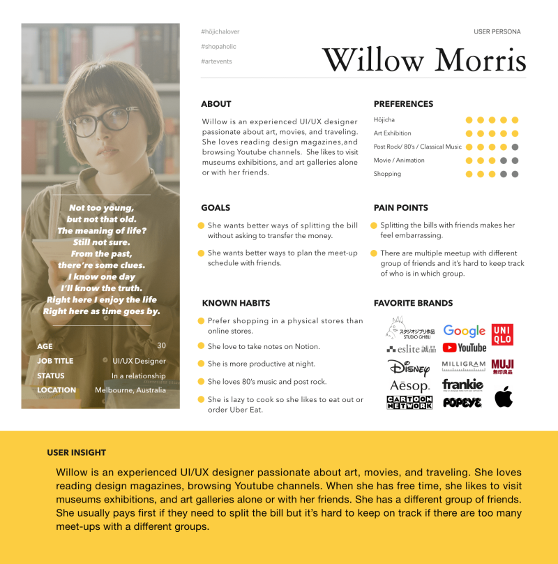
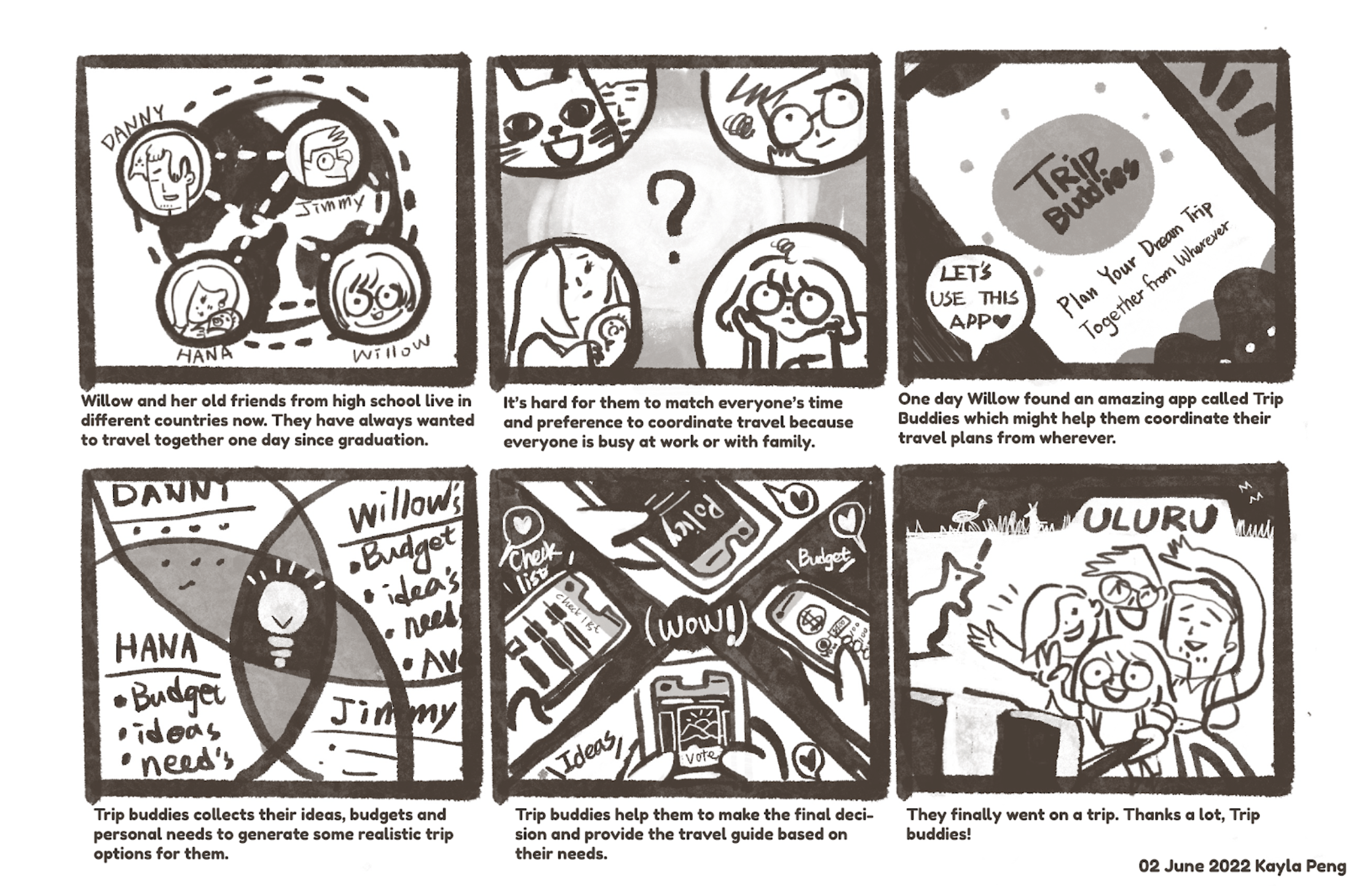
Willow, a busy designer who lives in Melbourne wants to travel with her old friends from high school, needs a better way to make a plan with her friends living in different places.
She needs:
- Find a common ground for their ideas with her friends.
- Makes plans faster.
- Some guidance to plan a realistic plan for them.
- Everyone is on the same page of the planning so far.
STORYBOARD
CUSTOMER JOURNEY MAP

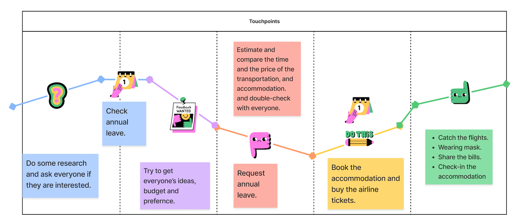
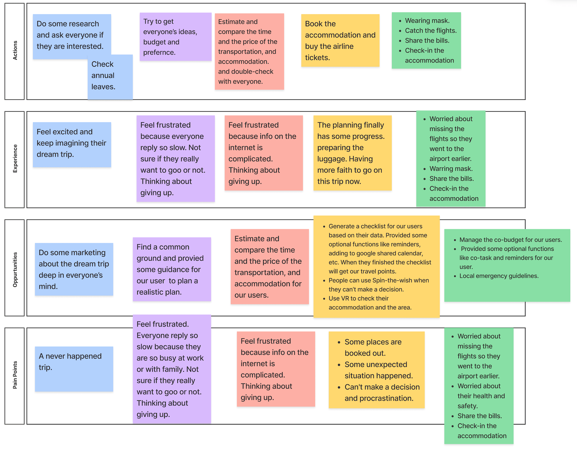
VALUE PROPOSITION
Value proposition
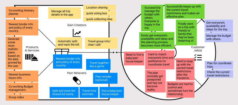
PROBLEM STATEMENTS

1. Planning Involvement
We have found that people find it hard to match everyone’s time and preference to coordinate travel because everyone is busy at work or with family.
As a result, travel planning normally gets postponed and has not become reality.

2. Financial Management
We have also found that people find it hard to manage the budget with others, like invoices missing, forgetting how they spend the money, etc.
As a result, budgets are hard to control and sometimes hurt the relationship.

3. Travel Restrictions
The other difficulty is that people find it hard to keep up with the current travel restrictions after the pandemic because the policy varies from country to country and it changes all the time. A lot of information online hasn’t been updated.
As a result, planning becomes even more challenging.
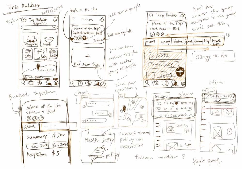
Lofi WIREFRAME
What I learned from the User testing is:
Users have reported confusion when navigating the website using both the footer and header navigation bars. To address this issue, I plan to introduce color changes to indicate the current page and provide a visual cue for users. This should help them understand their location on the website and reduce confusion.
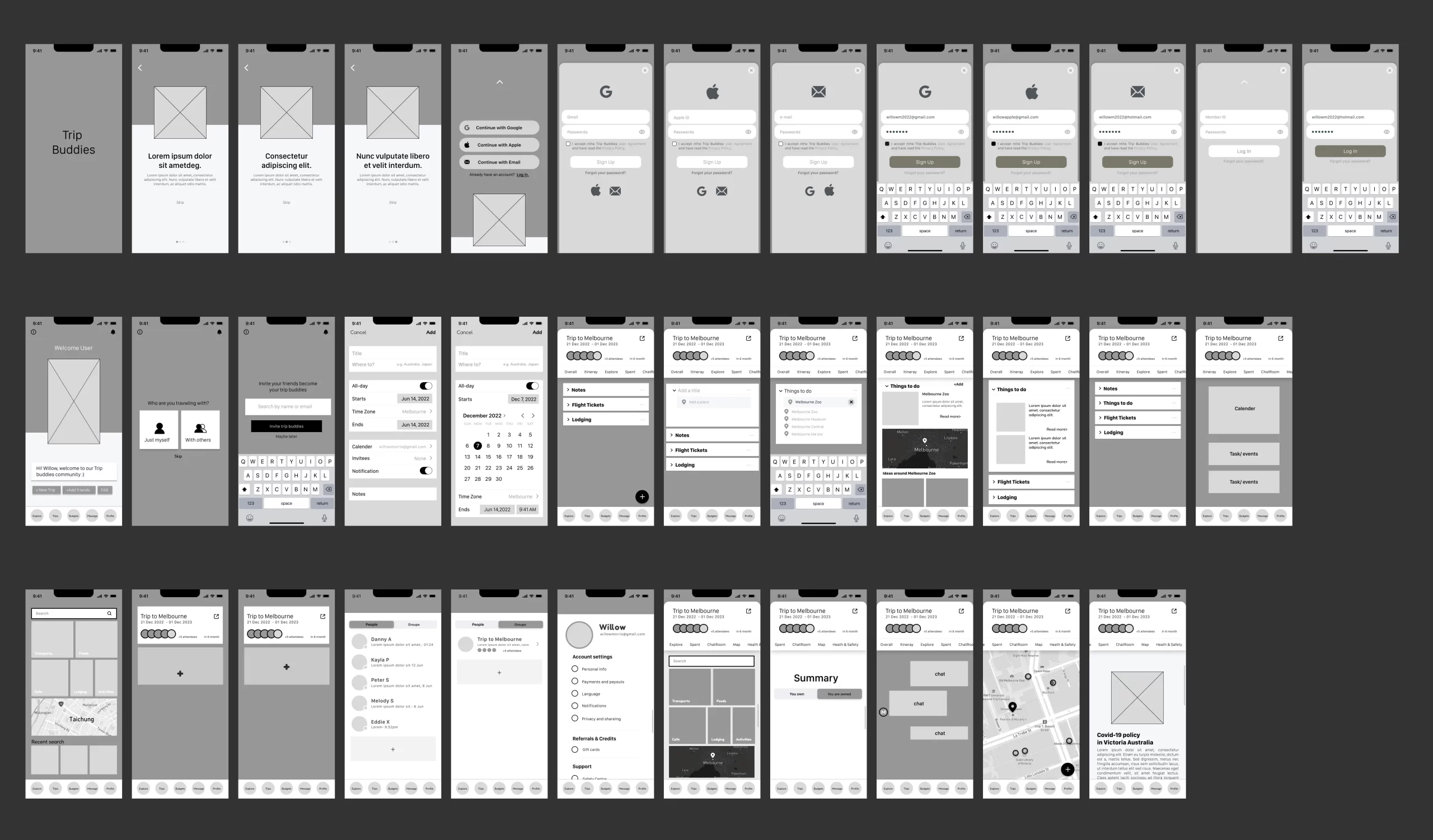
MID-fi WIREFRAME
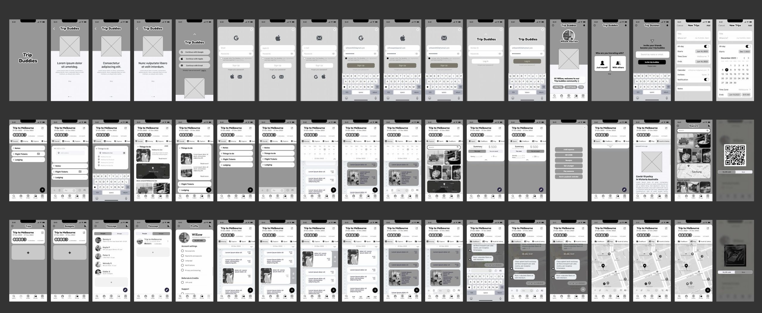
HI-fi WIREFRAME
Hi-Fi PROTOTYPE
LEARNING & TAKEAWAY
The most important learnings that I took from this project were:
Be curious and ask questions.
Always be curious about the user, and problem, avoid making assumptions too fast and learn from the evidence like research, data, and ideas and keep testing until we understand the why and find out the how, so we can decide the what.
Slow down, test first.
A high-fi design at an early stage could be dangerous as we’ll be changing so many screens once the user demand has changed even a little bit, so that’s why we keep exploring the low-fi/mid-fi prototype so much to make sure we have confirmed what to build upon.
Slides are not just about beautiful design but are also important to present clear key points/statements.
Version contral and showcasing your iterations are very important.
As a beginner in the field of UX/UI design, I had the opportunity to work on my first project during this bootcamp. While I was not very familiar with the principles of UX design or the Figma platform at the time, I was able to follow the instructions and complete the project. However, I made some mistakes along the way, such as not saving my iterations properly and moving too quickly to high-fidelity wireframes. Despite these challenges, I learned a lot from this experience, including important skills like user research, problem-solving, interviewing, prototyping, and presentation.
Overall, I found this project to be a rewarding and enjoyable introduction to UX/UI design, and I am excited to continue learning and exploring this fascinating field.
