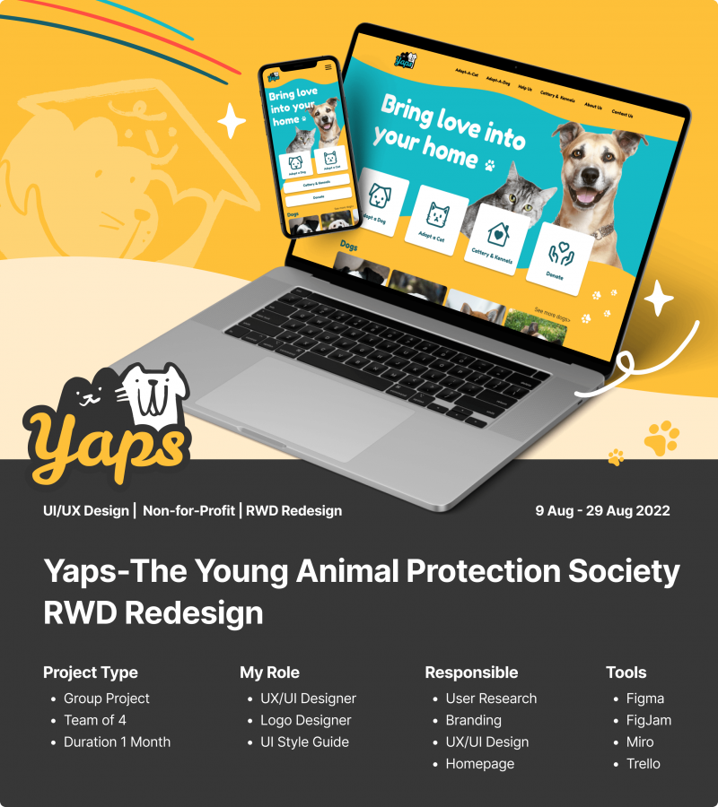
Yaps-The Young Animal Protection Society Inc.

PROJECT OVERVIEW
01 | Objective
To redesign the existing user experience on the Young Animal Protection Society website.
02 | Role & Deliverables
With my teammates, we did the initial User Testing, User Research, and wireframe together. I was responsible for the UI design, making the logo, the colour palette and style guide. I also created the Mid-Fi and Hi-Fi homepage visual artefacts for mobile and desktop.
03 | Challenges
In the early phase of this project. We found users felt the website looked quite old and all over the place, they were not sure if they could trust it. Also, a lot of links on the website are not very obvious to first-time users, the contents of this website are confusing and not well organised in a way to create an easy user experienced.
04 | Outcome & Impact
We highlighted key features of the website that are aligned with the organization’s needs such as Adoption/ Cattery & Kennels / Donations /Sponsors. Also adding the Step-by-step guide for adoption, Success Stories, and Business Sponsors on the homepage to increase the sense of trust and encourage potential adopters and sponsors to take action.
BACKGROUND

Click to see the current website.
YAPS-The Young Animal Protection Society is a not-for-profit animal refuge for rescuing abandoned and unwanted dogs and cats in Cairns and Far North Queensland.
We chose to redesign their website because we saw that they really needed a refreshed design while also giving us an opportunity to hone our skills.
PROCESS

In this project, we align with the Double Diamond Problem-Solving Strategy to explore challenges and generate ideas.
Also, we were only given 3 weeks for this redesign challenge project and all our team members have full-time work during the day. We used the Agile methodology to plan the task on Trello and we chose the research strategies shown below to reach our goal.
WEEKLY TASKS
- Research plan
- User guerrilla usability testing on existing website
- Stakeholder interview
- Competitor analysis
- Research analysis and Ideation
- Journey map
- Site map
- User flow diagram
- UI style inspiration mood board
- Digital wireframing
- Style tile and style guide
- Mid-fi prototype
- Testing
- Hi-fi prototype
- Presentation plan
- Presentation slides
- Presentation preparation
- Case Study
EXPLORE CHALLENGES

We initially interviewed 6 users, all within Australia and mostly in the young working male and female demographics. We asked questions mostly about their overall reviews of Yap’s existing website and wondered if it would be easy to search and navigate for them to adopt a cat on this website.
We found that some common pain points from the interviews are like:
-
The website looks quite old and not sure if they can trust it.
-
A lot of links on the website are not really obvious, some links are even hidden in a paragraph.
-
The content of this website is confusing and not organised properly.

Our project manager did the stakeholder interview to understand the aspect of business requirements, taking those insights from guerilla reviews, and the stakeholder interview, a list of ideas was prioritised into features. This will inform our website redesign.
We have prioritised based on the highest value for the user and the lowest effort to implement with the time we had available.

- Clean and local feel website design
- Clear adoption call to action
- A gallery/carousel of pets to choose from on the pet adoption pages
- Update the main navigation bar
- List of reviews and a list of sponsors
- More photos on the home page and on the site in general
- Inquiry button on pet BIO
- Clear pet BIO and categories
- Pet adoption criteria information/button for information on the adoption page
- Show dates “received/surrendered” on animal adoption BIO
- Guide to adopting a pet
- Segmented pre-adoption form to break it up into manageable chunks. Having this AFTER the initial inquiry
DEFINE CHALLENGES

To help us design for our users, the team developed a user persona. Our user persona is called ‘Samantha‘ and she has always wanted a cat. She has decided to adopt as she is passionate about saving an animal. She needs to be able to find the right information to help her understand her commitment when adopting.

USER JOURNEY MAP

A user journey map was created to showcase the problems and needs of our users, aligned with the opportunities we created from our features and ideas.
LAYOUT BRAINSTORMING

Our team collected some ideas to create our “Moodboard”. I was responsible for narrowing down those ideas and making some annotations based on I like/ I wish/ What if for the team. I found this way is really helpful when we need to communicate ideas.
HOMEPAGE LO-FI WIREFRAME

To determine the next steps we need to take in developing the website, we are hoping to learn if the positioning of key elements leads the user to the key outcomes desired by the organisation. Our team reviewed each other’s ideas for the Lo-fi wireframe for the Desktop Homepage. Once we decide what desktop layout we would like, I made several versions of the Lo-Fi wireframe for mobile, because we would like to start developing the user testing on mobile first.

We did a quick review with our team and our instructor. The third version was the winner, therefore we decided to start with this version for user testing on mobile devices.
USABILITY TESTING

We iterate this Lo-Fi to the Hi-Fi wireframe based on the insights we got from the usability test which are shown below.
Notes from the Usability Test

INFORMATION ARCHITECTURE

NEW WIREFRAME Annotation

UI STYLE GUIDE

Hi-Fi WIREFRAME

LEARNING & TAKEAWAY
The most important learnings that I took from this project were on the concepts of ‘scanning design’ that vastly improve user experience by:
-
Establishing a clear visual hierarchy
-
Clearly showing where the user can click
-
Minimising distractions
-
Making the most of commonly used design principles
-
Dividing the page into clear section areas
Most importantly it was also a delightful teamwork experience, I learned a lot from my team mates, such as user research, interviewing skills, prototyping skills and presentation skills.
I would like to give a big shout out to my teammates for their support and feedback on my logo and homepage layout design. Their feedback helped me make my design more complete and I helped me discover that I really love UI design!
Overall, this is a good teamwork experience for me and working with like-minded talented people is so enjoyable.